Behind the Build
Why We Built a Fasting App That Does Less
Every fasting app grows into a nutrition platform. We went the other way and cut features on purpose — here's what we removed, what it cost us, and why we'd do it again.
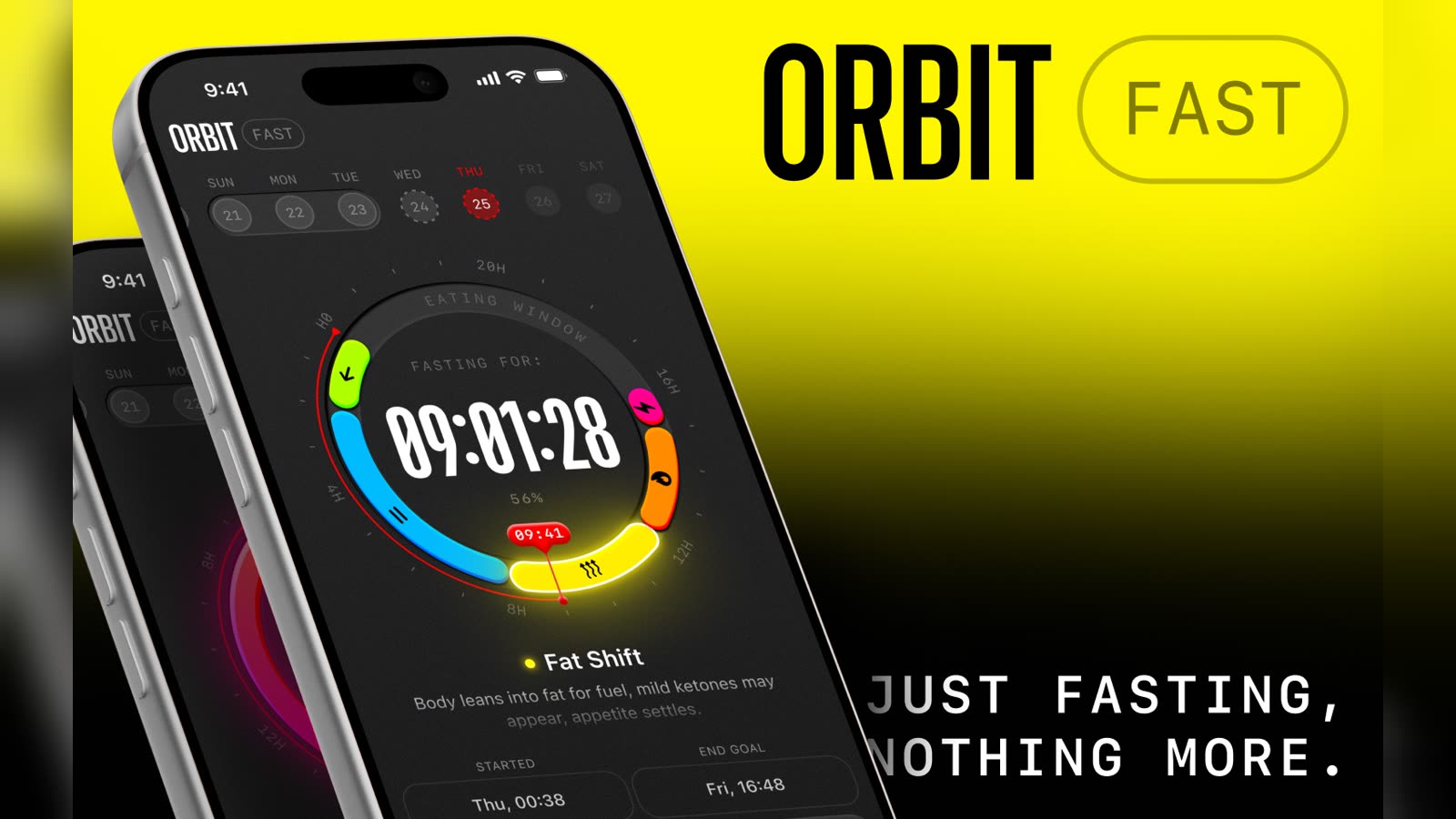
Every fasting app eventually becomes a nutrition platform. It starts as a timer, then adds meal logging, then a barcode scanner, then macros, then a coach, then a community feed. By version 4 you open it to check how long you've been fasting and get asked whether you've logged your water.
We built Orbit Fast in the opposite direction. This is what we took out, what it cost us, and why we'd make the same call again.
The problem with the obvious roadmap
The feature creep isn't stupidity. It's a rational response to two forces.
Retention metrics reward interaction. A timer is a bad product by conventional standards — the ideal fasting app is one you barely open. Every dashboard chart is another reason to launch the app, and every launch looks like engagement.
Every feature request is real. Someone genuinely wants water tracking. Someone genuinely wants weight graphs. None of these requests are unreasonable, and saying yes to each one individually is defensible. It's the sum that ruins the thing.
The result is an app whose core job — how long have I been fasting? — takes three taps to answer, behind an interface designed to keep you there.
What we removed on purpose
Calorie counting. The largest and most contentious cut. Fasting is a rule about when you eat, not what. Bolting calorie tracking onto it imports the exact anxiety many people took up fasting to escape.
Food logging. Same reasoning. Also: nobody enjoys it, adherence collapses within weeks, and an abandoned log makes an app feel like a failure you're carrying around.
The social feed. Fasting is not a group activity for most people, and health data is not something we want to encourage anyone to broadcast.
Streak guilt mechanics. We kept streaks, because they genuinely help. We cut the manipulative parts — no notification implying you've let yourself down, no dramatised streak loss. A streak should be a record, not a debt.
The content library. We write articles. They live here, on a website, where you can read them when you want to — not inside the app between you and the timer.
What that cost us
This is the part most "we keep it simple" posts skip.
We lose users who want one app. Someone tracking macros and fasting has a real reason to choose a platform that does both. We lose them, and we should.
We look thin on a feature comparison. In any side-by-side grid, the app with fifteen checkmarks beats the app with five. Our honest answer — that most of those checkmarks are costs, not benefits — doesn't fit in a table cell. We wrote our own comparisons (Zero vs Orbit, the best fasting apps) partly so there was somewhere to say it in full.
We can't lean on engagement metrics. If people open Orbit less over time, that might mean the habit stuck — or that they churned. Optimising for time-in-app would tell us to make it worse.
Some requests we decline are good ones. Apple Watch support is a genuine gap. That's a depth request, not a breadth one, and the distinction is the whole discipline: go deeper on fasting, not wider into nutrition.
The one rule
Every proposed feature gets one question: does this help you fast, or does it help us look busy?
Live stage cues survive it — knowing you've moved into ketosis is information about the fast you're actually doing. A barcode scanner doesn't. It's a feature about food, sitting inside an app about time.
It reads as obvious written down. It's hard in practice, because the second category is where growth teams reliably find something to ship.
Design isn't decoration here
"Design-led" usually means it looks nice. What it means for us is that the interface is the product, because there's nothing else. When your app does one thing, the quality of that one screen is the entire experience.
So the timer is legible at a glance, in sunlight, half-awake. It works in light and dark without either feeling like an afterthought. Nothing moves that doesn't need to. There's no upsell interrupting the thing you opened the app to see.
That's not restraint for aesthetics. It's what's left when you remove everything that isn't the job.
Would we do it again?
Yes — with one honest caveat: this only works if you're willing to be a smaller product. A fasting app that refuses to become a nutrition platform has a ceiling. We know roughly where it is.
The trade we made is a smaller audience that opens the app for four seconds and gets exactly what they came for, instead of a larger one that tolerates an app they've stopped trusting to be quiet.
If you've bounced off fasting apps because they turned into something else, that's who we built it for.
Built by two people. If you disagree with any of this — particularly the calorie-tracking call — we'd genuinely like to hear it: send us feedback.